✨ Key Features
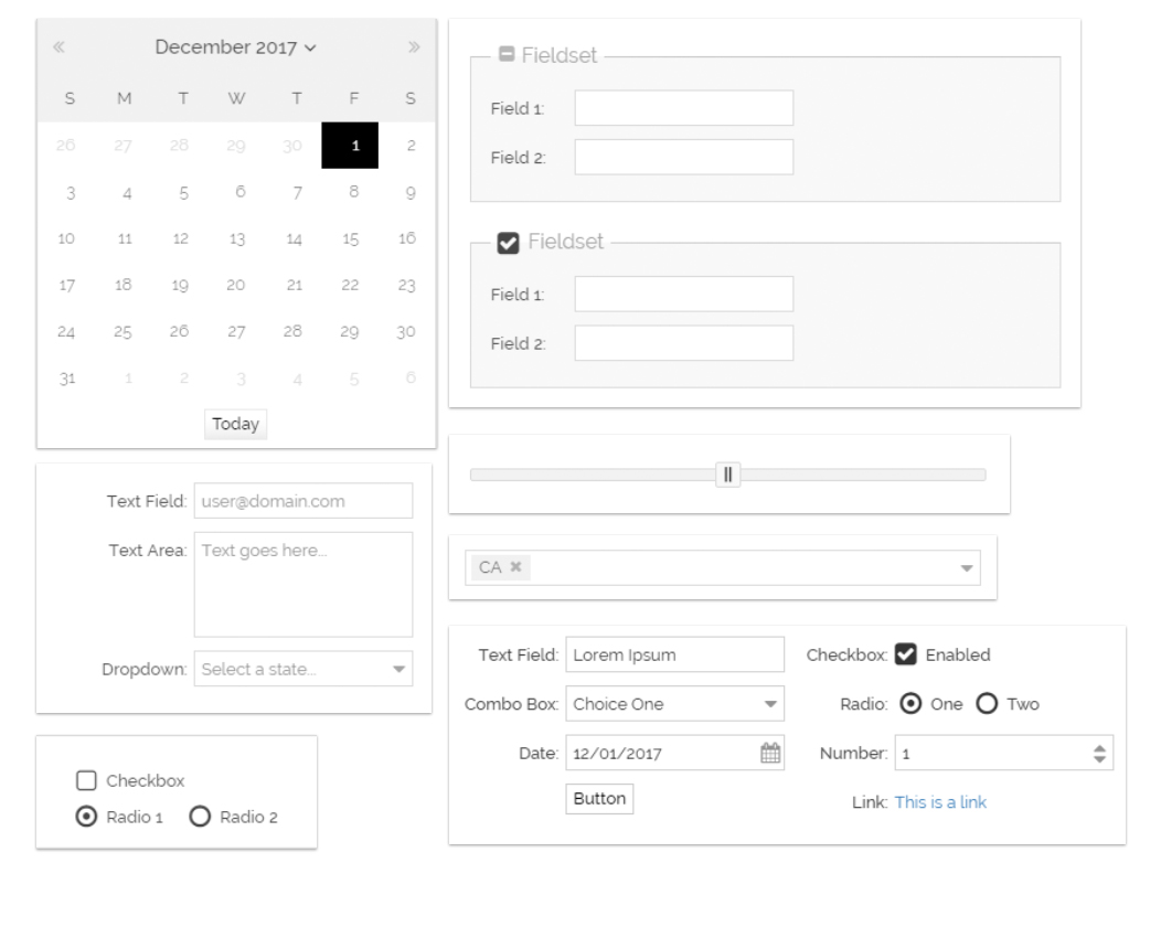
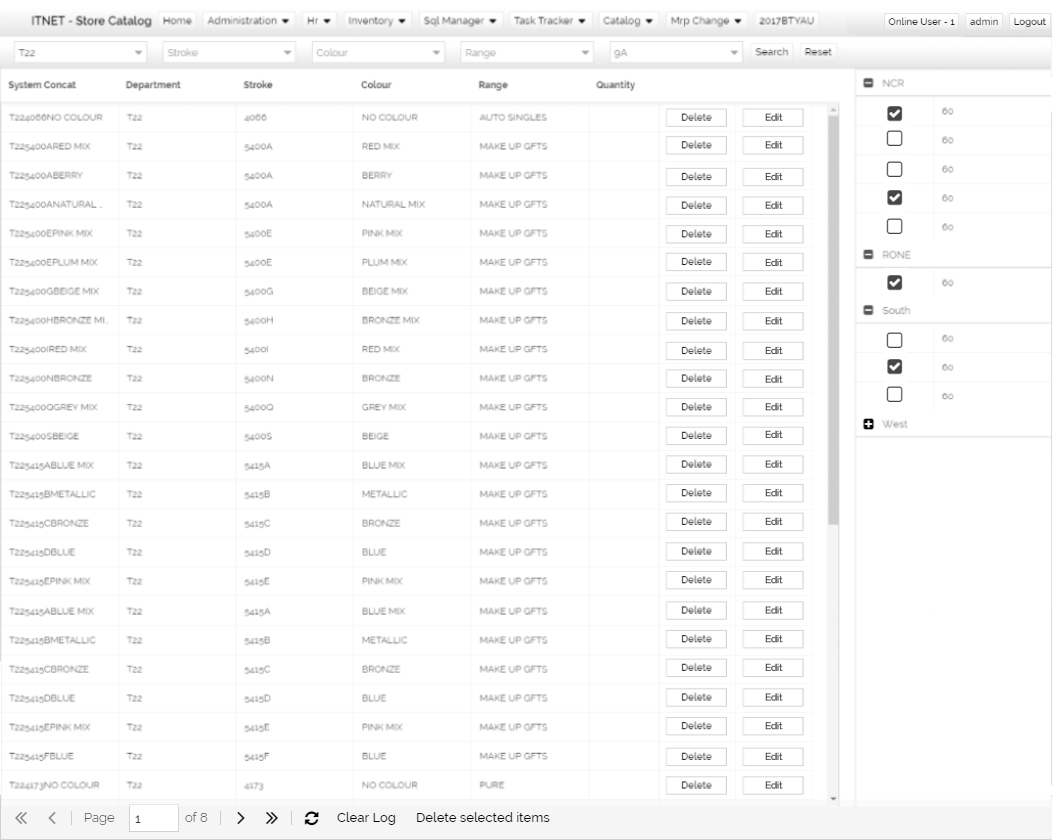
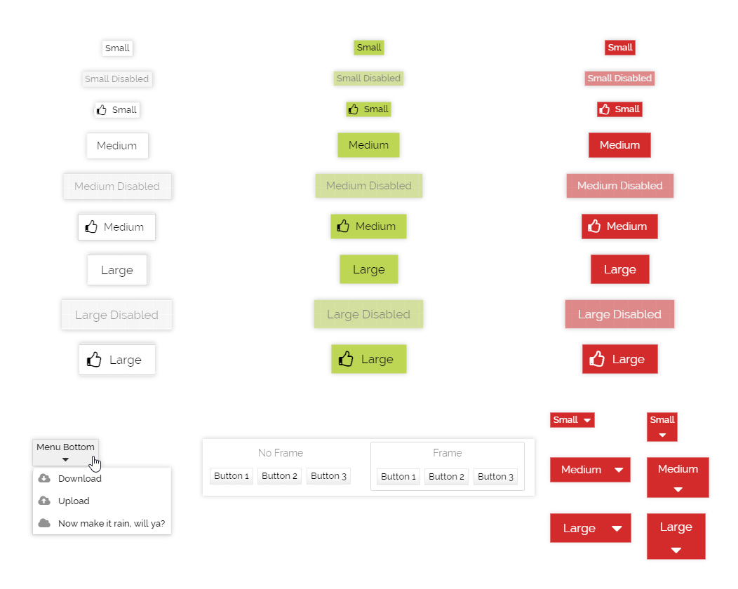
ExtJs Themes are packaged style sets and UI assets that override and extend Sencha Ext JS component styling (buttons, grids, forms, menus, panels, charts, etc.) to deliver a cohesive visual language. Each theme includes CSS/SCSS variables, theme tokens, component overrides, and ready templates so developers and designers can apply a new brand skin quickly while preserving Ext JS behavior and performance.
🎨 Ready-to-use Theme Packages
Prebuilt themes that you can drop into your Ext JS app to change the entire look & feel instantly.
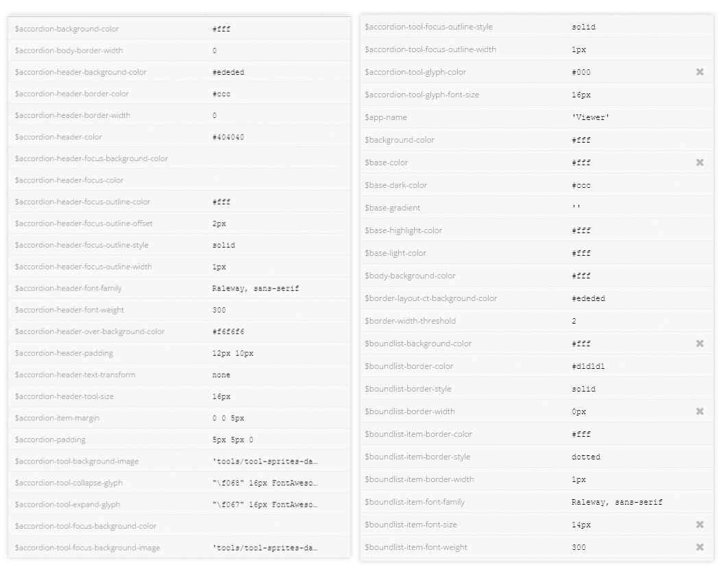
⚙️ SCSS Variables & Tokens
Deploy intelligent virtual assistants trained on your own data. Integrate OpenAI-powered bots to answer FAQs, collect leads, or guide users through complex workflows.
♿ Accessibility-Focused
Contrast and focus styles tuned for better accessibility and keyboard navigation.
🧩 Component Overrides
Styled grids, forms, toolbars, trees, charts and other common Ext JS components preserved with native behavior.
🛠️ Developer-Friendly
Includes build scripts, theming guides, and example apps to speed integration.
📦 Lightweight & Performant
Optimized CSS, lazy-loaded assets and minimal runtime overhead for enterprise performance.
Benefits — Why use ExtJs Themes?
⚡ Fast Visual Refresh — Rebrand or modernize UI in days instead of months.
🎯 Consistent UX — Ensure uniform component behavior and look across modules and teams.
👩💻 Developer Productivity — Remove repetitive styling tasks so devs can focus on features.
🛡️ Maintainability — Centralized tokens and variables make long-term maintenance and theming predictable.
💼 Brand Alignment — Match corporate identity (colors, typography, button styles) across all Ext JS screens.
🔄 Reduced QA Effort — Component behavior remains untouched; only presentation changes, reducing regression risk.
🛠️ How it works — quick integration
1. Choose a theme package — pick a prebuilt theme that closest matches your brand or UI intent. 2. Install the package — add via your package manager or drop the SCSS/CSS into your build pipeline. 3. Configure tokens — update SCSS variables (colors, fonts, spacing) to match your brand. 4. Build & test — run the included build script to generate the theme and test across key components.
✨ Pricing
Standard With Css Only
- STANDARD SENCHA THEME
- ACTIVE WINDOW HIGHLIGHTING
- ELEMENT COLOR INHERITANCE
Terms: You can reach out to Imbibe support via Contact us page if you would like to have a live demo for the theme prior to ordering. Orders are shipped within 1 to 6 working hours IST once placed. You would receive an email with a link to download the resources for the theme based on the edition chosen. No refunds would be issued once the theme download link has been sent to you via email post ordering.
You would be entitled to use the theme within your organisation only (including projects developed for your clients by your organisation). Re-distribution or sharing of theme outside your organisation or by clients of your organisation in any manner is not permitted.
Full text of the license can be found here.